INDUSTRY:
WEBDESIGN, UX
CLIENT:
DONKEY
YEAR:
2024

Donkey
helping parents connect with childcare, effortlessly.
Redesigning the user experience for Donkey's website to make information more accessible for parents, while keeping the brand’s familiar and trusted feel.
context.
Donkey is a childcare center that asked for a website redesign. Their main goal was to modernize the site and make it more informative and accessible for parents, without losing the familiar look and feel of their current branding.
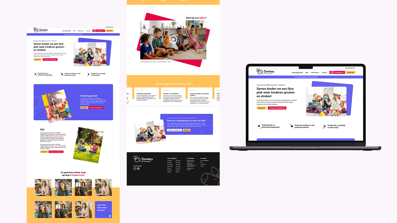
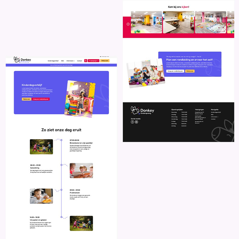
I started by identifying the needs of the target audience, mainly parents seeking practical information and a clear overview of Donkey’s services. Based on these insights, I designed a prototype in Adobe XD to explore new layout structures and improve user flow and navigation. While the shapes and overall design were updated for a more modern look, the original color palette was preserved to maintain brand recognition.

ux highlights.
Playful testimonial section featuring children’s voices
Testimonials are presented under fun, child-like headers, showcasing feedback from the kids themselves. This adds authenticity and emotional value, giving parents a glimpse into how their child might experience the daycare. It also breaks from the typical "parent-only" perspective, creating a more warm and joyful tone.Clear and welcoming hero section
The homepage opens with a friendly headline and engaging imagery that instantly communicates warmth, care, and the brand’s identity. The primary CTA ("Plan een rondleiding") is prominently placed, helping users take immediate action.Structured navigation
The top navigation menu is simple and organized by relevant categories (e.g., "Kinderdagverblijf", "BSO", "Informatie"). The parent portal login is clearly visible, making it easy to access.Human connection through team section
he staff introduction adds a personal, human touch. Parents can see who cares for their children, which builds trust.Embedded video for engagement
A video section with a strong visual prompt invites parents to take a look inside the daycare, offering a more immersive feel than text alone.
result.
The result is a user-friendly, responsive website that feels familiar yet fresh. Offering parents a smoother and more intuitive online experience. Parents can easily find key information.

